How To Avoid Being Swallowed
It’s impossible to overstate how big an effect your environment has on your nervous system.
Living in urban environments, it’s easy to forget that human beings evolved, literally, in nature. Our nervous systems are attuned to cues that have been in place for millions of years–when to wake up (light gets blue), when to go to sleep (light gets rosy and orangey and fades away), when to run like hell (rustle in the bushes), when to grab your spear and jab it in all directions as frantically as you can, because you are actually being swallowed (light gets very red and black indeed.)
Then, a few hundred thousand years later, inhabitants of the inner city so far forget their roots as to paint their windowless bedrooms like this:

redroom
Actual interior of hipster bedroom.
and think that somehow they can avoid the repercussions. (Which, in my observation, usually range from nasty divorces, to arrests for assault and battery, to psychiatric hospitalization.)
This is one of the many reasons that we at Practical Sanctuary take our wall colors so very, very seriously.
Our domestic partners may get annoyed with us. “Don’t paint the kitchen, we’ll just have to re-paint it when we move out, like, five years from now.” “We don’t have to hang that rug on the wall before the party, it’s no big deal.” “It’s just a rental, why are you bothering?”
These people may believe that their sense of well-being, productivity and ability to sleep at night does not hinge upon the color of their bedrooms, but these people may be wrong. Most of our nervous system responses are hard-wired and beyond our conscious control. And doing battle with stress-inducing ambient cues, day in and day out, has devastating consequences.
So, forthwith, we provide a primer on How To Choose Your Room Colors.
Step 1: Ask yourself how you want to feel in a particular room.
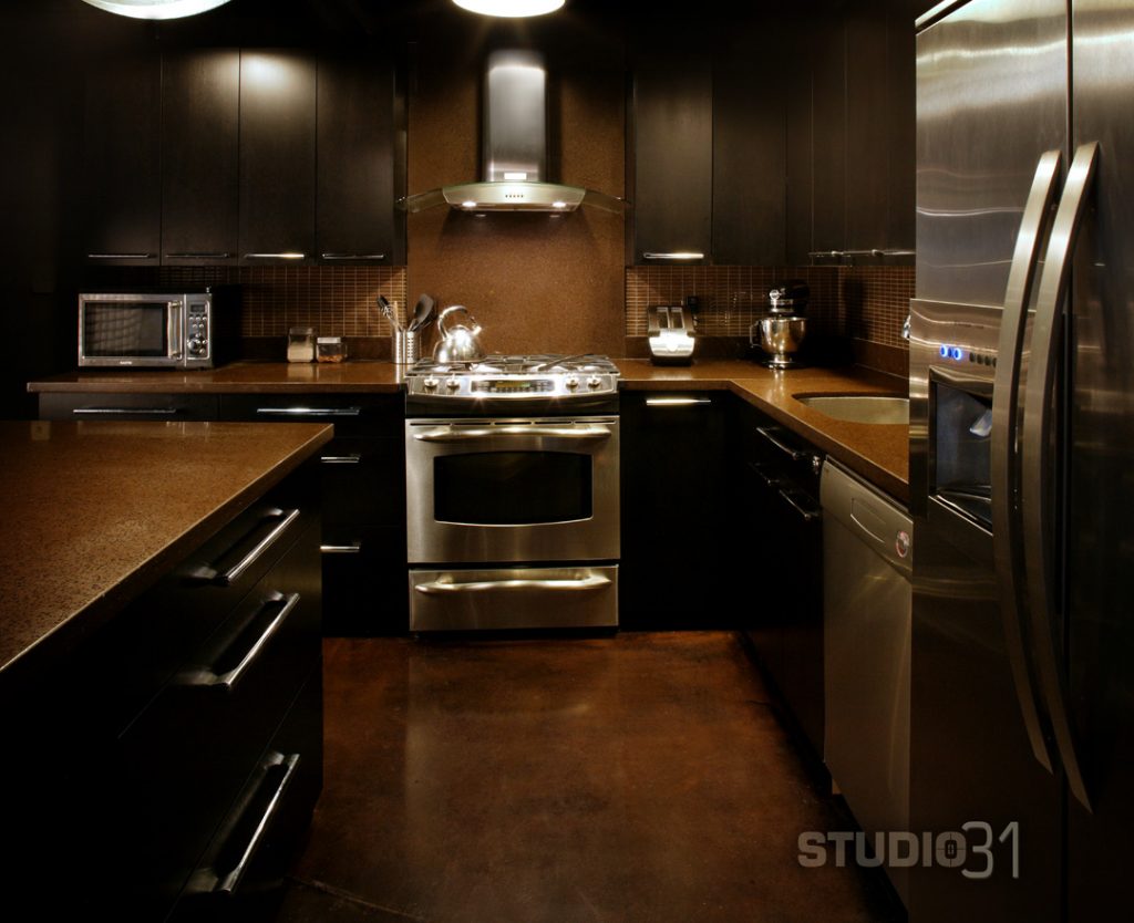
Nobody ever says to themselves, “I want to feel angry, nervous and depressed when I go into my kitchen.” Instead, their kitchen designer, who always orders take-out, says, “Kitchens should be elegant, timeless, and cave-like. Because our ancestors cooked in caves.”

darkkitchen
A very elegant dungeon.
This is the kind of kitchen that induces you to stick a Stouffer’s in the microwave and scarf it with a chaser of bourbon, because what’s the use?
Your kitchen, ideally, should inspire you to make fabulously creative, scrumptiously healthy meals for the crowd of awesome people who wandered over with a bottle or three of good wine, because it’s just so much fun to hang out there.

BrightKitchen
Come on over! We have everything!
But in order to figure out what colors will provide that specific company-and-wine-attracting vibe, you must perform:
Step 2: Honestly analyze the quality of your natural light.
The biggest mistake I see enthusiastic room-painters making, in the upper Northern Hemisphere, is going into denial about how much light they have access to, or thinking that they can fake it.
Let me explain. The closer a person lives to the Equator, the drier the climate, and the higher the altitude, the jollier the colors they can get away with. This is why Tibetan Buddhist monasteries are painted the way they are.

Tibetan Buddhism Temple India
Joy!
Bright, strong, clear light, coupled with high ceilings, can carry a palette straight out of Romper Room. Nothing ever clashes in direct sunlight. The louder the better. There are walls in Mexico that you can practically see with your eyes closed, so saturated, enveloping and pervasive is the color. It’s not tacky or horrendous in the least.
But when you try to convert your low-ceilinged, north-facing, ground-floor apartment into your own little Buddhist temple, north of the Tropic of Capricorn, nightmares ensue.

horriblekidsroom
Please, kill me now.
General rule of thumb: the higher the ceiling and the larger the windows, the more you can use saturated colors. The lower the ceilings and the foggier your light, the more you have to dust it down.
That doesn’t mean you can’t go bright; it means you must go oblique. You use colors with earthier hues. Dusty rose instead of cotton-candy pink; butternut yellow instead of sunflower. You can get away with almost anything, as long as you mix a good dollop of some phlegmatic neutral into your glowing paint bucket.

paintbuckets
I guarantee that every one of these colors contains a splash of ochre, umber or black.
Step 3. Don’t try to brighten up a dim room by painting it white, or beige, or pastel.
This is one of the most counter-intuitive principles in space design: white is not bright unless there is a ton of natural light to reflect off it. If you paint your basement apartment pure white in order to stave off a cave-like ambiance, adding a lot of excellent halogen lighting to ensure you don’t get S.A.D., you will merely create the effect of a refrigerated subterranean laboratory. Instead, pick warm, luminous colors in mid-range tones.
Step 4: Don’t be afraid to go personal and eclectic.
Matchy-matchy is tacky-tacky. Show me a room full of furniture that was all purchased at the same time (most likely from the same suburban shopping mall), and I will show you a room without a soul. A soulful room is curated, rather than designed. Before you go running out to buy a lot of stuff, take a good look at the stuff you already own. Do you like it? If not, get rid of it. If so, pick out the stuff you like best–like an Oriental rug, an antique table or a tiled mirror–and choose colors that show it off. Pick one of the tones in your rug and paint the wall with it; match the curtains to one of your tiles. Play around with visual jazz.
And if you have no idea what to do next, drop us a line and we will help you out!
Share This Story, Choose Your Platform!
More to Read

The Eccentric Genius Habitat Intervention
Your space, your nervous system.
Most of us were never taught how our bodies actually experience a room–the light, the sound, the layout, the smell–and what happens when those things work against us instead of for us.
This free seven-day course is a gentle introduction to sensory design. Each day brings one exercise–noticing what you feel, photographing what you’ve been editing out, dreaming about what you actually want. The exercises are all optional, and you can go as deep as you like.
By the end, you’ll understand more about why certain rooms drain you, what your body knows about your home, and how to start shifting without stressing out.
Sign up below. Your first email arrives within the hour.

Practical Sanctuary, sensory interior design, specializes in interior design for highly sensitive people.
We help you create spaces which are:


