Designing For The Public

LibraryAtrium
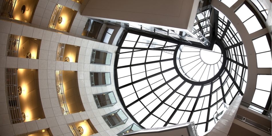
The atrium skylight of the San Francisco Public Library: an awe-inspiring booby trap.
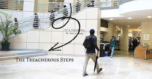
Our patrons kept falling. We couldn’t stop it from happening. As we sat, helpless behind the Information Desk at the new San Francisco Main Public Library, we watched an endless parade of hapless souls as they trooped into the atrium, gazes lifted in awe toward the magnificent skylight–and went tumbling down the two unmarked steps at their feet.
First, we put up a sandwich board. “Watch Your Step!” Then we called Facilities to install a hand rail. It was unstable, unattractive and not architect-approved, but it prevented a few face-plants. We marred the elegant granite floor by sticking down some black-and-yellow caution tape. We put down floor mats to make the granite less slippery.
Library patrons were our employers, our vocations, our responsibilities. They came from all over the world, speaking all languages. Some were disabled. Some were mentally ill. Some were homeless. This tide of humanity surged into the atrium, fetched up against the Information Desk, and asked for help. We did our best for every one.
But we couldn’t keep them upright, from thirty feet away.

The Treacherous Steps
Such small steps, so many tumbles.
Visionary Space?
The treacherous atrium wasn’t the worst problem with the design. A more pressing issue was that the brand-new building lacked enough shelf space to house the existing library collections, let alone have room for new books. There weren’t enough check-out desks to handle the volume of visitors, and the book-sorting room was so small that it overflowed into the hallway, while the book-return chute shredded the books.
Wait times to find a book, check out a book, and get the book back onto the shelf after it was returned extended to weeks, if not months. San Francisco citizens, having approved a $105M bond to fund their library, were understandably furious.
It took twelve years and another $17M for the building to be reconfigured enough to function, more or less as it should have to begin with.
This Could Have Been Prevented
The thing is, WE KNEW THIS WOULD HAPPEN. For months before the new building opened, librarians were sounding the alarm about the shelving space, the circulation desks, and the general layout of the building. It was downright weird that the main entrance was on the second floor, and the path to the Library for the Blind was marked by a visual stripe on the floor that led two thirds of the way around the mezzanine.
(The designer’s rationale? It’s the Library for the Blind and Visually Impaired. The stripe is for the people who aren’t completely blind.)
But the Visionary Architectural Committee never asked for our input. Nobody interviewed the clerical assistants who shelved the books about circulation dynamics. Nobody talked to the librarians in charge of collections development about square footage. They didn’t consider the demographics of library patrons, noting that among the thousands of visitors per day, one or two might be a suicide risk.
Sensory Design: All About Inclusion
Back when I was a librarian by day, artist by night, and massage therapy student on weekends, I had no plans for creating a sensory interior design business. ‘Sensory Interior Design’ was not yet a thing.
But librarian values stuck with me. Values such as: all people should have equal access to knowledge and safe spaces. Every human is important. A public space should serve the needs of the public.
When sensory designers work with clients, whether they be an individual, a family, or an institution, the first thing we do is ask questions of all stakeholders. Lots of them. Questions like, “what do you need? Tell me about this–what’s working and what isn’t? Do you love this? Where are you struggling?”
When you tell us what you need, we listen to the answers. Your answers determine our goals, and when we establish those goals, we come back to you and double check if we got it right before we start designing.
Don’t get me wrong–spiral skylights are fantastic. But for a building to be truly accessible and inclusive, they’re just the beginning.
Share This Story, Choose Your Platform!
More to Read

Are you an eccentric genius?
You’re in the right place, darling.
In this free e-course, you will discover:
The ONE design mistake that NEARLY ALL HUMANS make in their habitats, and how to fix it in 15 minutes. (You will roll your eyes. And cry.)
Three senses your kindergarten teacher didn’t mention. (And how they make you a NINJA.)
The design trend which created an epidemic of shut-ins. (NOT COVID-19. Some of us now know the meaning of schadenfreude.)
Why Febreze is EVIL. (There should be a warning label.)
What kinds of light fixtures will be BANNED when the establishment comes to its senses.
What color has to do with hormones. (And how to leverage it–St. John’s Wort, piffle!)
What NEVER to do, ever ever, if you do not wish to induce psychosis, extreme depression, vertigo, or actual regurgitation in guests and members of your own family. (We all love those Bad Examples.)

Practical Sanctuary, sensory interior design, specializes in interior design for highly sensitive people.
We help you create spaces which are:


